How presentation became identity
Japanese console packaging has always gone beyond practicality. Every box has served as a visual expression of a company’s philosophy. The first Famicom boxes, covered in bright colors and cheerful illustrations, introduced a sense of playfulness that defined the early era. As technology advanced, design language shifted toward sophistication. By the time of the PlayStation 2, packaging had evolved into something sleek, understated, and confident. Collectors of Accessories often see these transitions as milestones of design maturity rather than simple product changes.
The rise of precision and minimalism
While the 1980s celebrated excitement, the 1990s introduced a wave of refinement. Sega and Sony emphasized geometry, symmetry, and material texture. Their packaging was less about shouting for attention and more about whispering quality. The Retro Gaming market still reveres these design shifts, where even the choice of font or box laminate communicated innovation. The PlayStation’s white-and-gray contrast signaled a departure from toy-like marketing toward lifestyle technology.

The original PlayStation box, with its disciplined layout and clean edges, remains a triumph of minimal design.
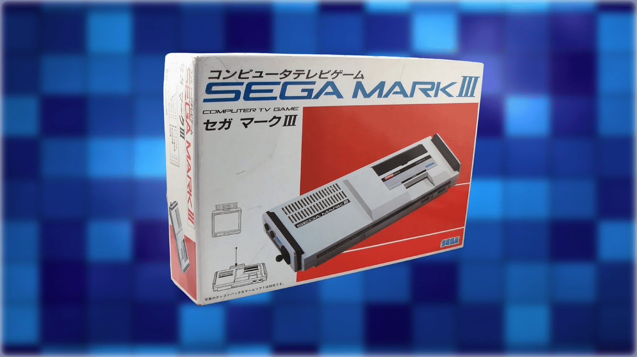
Materials that defined an era
Japan’s commitment to craftsmanship extended to cardboard, printing, and coating techniques. Companies experimented with glossy finishes, metallic inks, and embossed logos to create tactile depth. These materials were never random. They reflected an obsession with precision that matched the quality of the consoles themselves. The Collectibles community now values these physical details as much as the hardware they encased. A sealed Famicom or boxed Super Nintendo from Japan feels different not only because of rarity but because of how the materials age.
The role of typography and layout
Typography is often overlooked, yet it carries cultural meaning. Japanese box design merged bold English lettering with subtle katakana placement, achieving a hybrid aesthetic that appealed both locally and globally. Layouts balanced energy and restraint, using color fields to guide the eye. Collectors who study packaging across generations notice how Sony’s clarity and Nintendo’s warmth created two distinct schools of design. For those preserving Home Systems, typography often determines whether a box feels timeless or dated. The Dreamcast logo, with its minimalist swirl and rounded typography, embodies this harmony perfectly, modern, playful, and unmistakably Japanese in its balance of motion and simplicity.
Cultural influence on global design
Japanese console packaging changed how the world saw electronics. Its blend of order and emotion inspired designers across Europe and the United States. Apple’s minimalist product boxes in the 2000s owe part of their lineage to Sony’s PlayStation 2 era. What Japan perfected was the ability to make packaging part of the product experience. Unboxing became ceremonial, an interaction that enhanced anticipation. The global market for Japanese packaging continues to grow, with collectors and museums treating it as design heritage.
Final reflection
The evolution of Japanese console packaging reflects a culture where design and craftsmanship are inseparable. Each generation tells a story of precision, emotion, and visual storytelling. For collectors, these boxes are more than cardboard—they are enduring symbols of how Japan turned presentation into an art form.

Share:
RetroPixl 2021 Year in Review
The Resurgence of the Game Boy Micro